Thursday, February 21, 2013

Digital Painting: Beware, Colors on Screens

I started doing digital painting last summer and I have improved a lot. I love doing it, but even till now I still do not feel comfortable drawing on tablet or Cintiq. I become extremely fussy about the texture, the look of the brushstrokes and so many more. Sometimes, I could not even put a single stroke down. This is very very frustrating. I feel freer when I'm using pastel or pencil on paper.
I try to find brushes that have simular texture to real world medium.
(Study of filme still from City of Ember ) This one looks better on Cintiq screen
Digital painting has another characteristic that is both a disadvantage and an advantage.
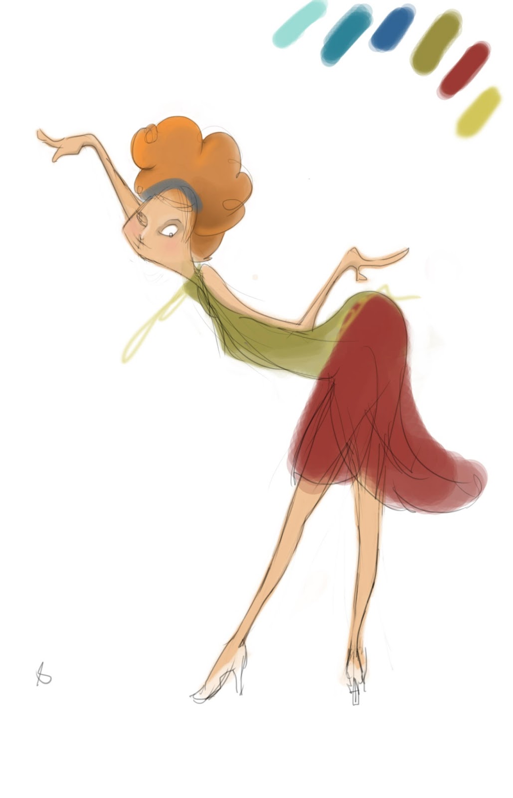
Right now I'm looking at the this painting on two different screens.  This is what I see: The image on the left screen looks greener compared to the image on the right. So with different computer screens, the colors are going to look different. I never thought about it until couple hours ago I moved my painting to another screen. (Wow)
This one looks good on a mac but looks over saturated on Cintiq 
However this can be fix in less than a minute by adjusting color balance, contrast or levels (This is the trick for digital painting. I often have to increase the contrast of my painting because I am too timid to put down bold colors)

Update:
Back to my own computer, now I feel like the second image is a little over saturated...

Wednesday, February 20, 2013

Hills Trees and Stars

I still like to draw simple and I love green. Green used to be my least favorite color, and now it has become my favorite color palette. I just never get tired of drawing trees and hills, so here's trees and hills.
There's a man standing on the hills
I'm also addicted to paint with 30° angle afternoon sunlight and 30° angle dawn light


And, I just couldn't resist making another sky painting, so I made another night sky painting. I'm not satisfy with the sky yet. There's too little stars. I want it to look like supernova explosion with lots of star clouds.

Monday, February 18, 2013

Piano Guy

He doesn't look as exciting as the lady I painted in pervious post, still looking a little flat, but I'm going to leave him like this for now.  I'm recycling my Project 365 sketches. I'm so happy I can paint colors now! (not just with a character sticking on a white background, but with character interacting with the environment) ACCOMPLISHMENT! PROGRESS!

I have been working on my short this week, keying out key drawings and finding reference for the backgrounds. Ah, back in the good old days of getting tanned from fluorescent light bulb.

Saturday, February 9, 2013

Color Temperature

Yesterday I did a study of lights and color temperature using photograph and Photoshop's eye dropper tool to figure out the relation of the colors. 


 Today spend the whole day practicing. I can feel my eye balls twitching already.


Thursday, February 7, 2013

COLOR COLOR COLOR

I thought I knew color really well. It turns out I don't really understand color...
I spend the whole day trying to figure out the color for THIS! 
And it still looks monotone. I have spend at least 6 hours on this. 

Then I spend an hour on this
And it turns out pretty good. 
WHY?????
Is it because I spend too much time on the first one!? or is it that the second drawing happen to be kind of monotone so I can do it with ease!? I think the issue I have with the first drawing is that I didn't start it with vibrant colors so the colors just gets muddier and muddier and muddier. This just reminds me of my oil painting lesson: always always always start with vibrant pigments!  I can only make my paintings muddier as I put on the next layer. The other big problem is that I have no idea the direction of the sunlight. 


I didn't know what I ate today but my stomach hurts

Sunday, February 3, 2013

First Post in 2013

January is such a good month. I took a break and did not make any animation at all or update my works. Opps.
I did do something drawings during my break.
I just have to put the giraffe on XX large size to get the feel of their long neck. It looks good on my screen. I don't know if it will look good on other people's screen though. I think the neck could be even longer.

I don't remember what the name of the bird.


I got distracted by all the good food while I was back in Taiwan so I didn't brother finishing them. I also got distracted by watching anime and reading manga (I call this "researching" I discover a lot of good techniques for composing shots by watching anime.)

February is also going to be a good month. I finally have the storyboard thumbnail of my walking box film.