Wednesday, April 27, 2016

Sketches of the week

This is the Wizarding World of Harry Potter. While I was sketching I noticed none of the buildings are straight. They are all slightly crooked. Interesting right? I wouldn't noticed it if I wasn't drawing.
Because everything is crooked makes them a little hard to draw. Perspective kind of work here but the those buildings can confuse you. 


before toning

 Because nothing is straight the drawing looks like they are off perspective. or maybe they are?


before toning
I use shapes more than lines (personal preference) but sometime with complex patterns or decorations lines will be a better way to show those detail.

Here some process photos:


Final


final

This is the rough placement of where the trees and plants will be


final
With organic subjects I find using shapes easier


this one didn't turn out so well but next drawing!


I haven't done color in a while. It's about time to go back to full palette.

Wednesday, April 20, 2016

Side by Side

I recently discovered a documentary called "Side by Side." 


I think film is better than digital. I value film because the images are made from psychical contact with light. It stored much more information than digital camera we can build now.
What fascinates me with film camera is its mechanics, with digital camera that element is kind of...lost.

There is German Film Museum (Deutsches Filmmuseum) in Frankfurt I really enjoyed the last time I visited. It has a collection of objects that creates illusion of space and movements.  Visitors are welcome interact with the objects.


Perhaps I am a little close minded. Yet, I always imagine in the future, we will no longer be looking at a flat screen but walk inside a virtual reality space where you become present in the events. A bit like this experimental piece "In The Eyes Of The Animals" (or ever scarier completely simulated in your head like dreams). We are already seeing some of the technology been development like the Oculus glasses. If this vision ever became true, cinema form will be completely different. All the knowledge on cinematography, composition, editing and lighting we have now that are based on creating illusion of three dimensional space on flat space will need to adopt to the change. 

At the end I wish film will not be a dead form of art in the future. 

Thursday, April 14, 2016

What Paint Color Should You Get?

This is the longest post I have every written.

A lot of people when they start painting don't know what color they should get.
Paints are expensive so buying them all and try them all is not a realistic option.
A good way to find out what to get is to look at pre-packed sets. Those are usually the stander colors to have.

To mix a range of colors you need the primary color: Red, Yellow and Blue
And a large tube of white.
You will also need warm and cool of each color.
Why do you need warm and cool of each color I will explain later.

The Stander Full palette: 
Lemon yellow (cool yellow) 
Cadmium yellow (warm yellow)
Cadmium red "light" (warm red) 
Permanent alizarin crimson (cool red)
Ultramarine blue (warm blue )
Cerulean blue (cool blue)
Titanium white

Those paints have the pigments to mix almost any color you see.

A list of traditional pigments for oil painting:
(Watercolor has a different list)
Ralph Mayer. The Artist's Handbook of Material and Techniques

When looking at a subject, there are 3 things to observe before start mixing
Light/dark (value)
Local color
Warms/cools(color temperature)


Value
Value is perhaps the easiest to comprehend. It is also the most important. Think of it as a foundation for your painting.  Value studies allow you to see light and negative space without the distraction of color. That is why it is good to practice black/white in the beginning.

Before going into color, I want to throw in some biology lesson. It's helpful, trust me.
Our eyes see grayscale in dark space and vivid color in bright space.
It has to do with the structure of our retina.
There are 2 types of photoreceptor on the retina: Rods and Cones.

Rods:
  • Sense light and dark 
  • Responsible for vision in low light level 
  • 20 times more numerous than cones
Cones:
  • Perceive colors (3 different types: "red" cones (64%), "green" cones (32%) and "blue"cones (2%) Which brings to another topic of "when do we start seeing blue?")
  • Responsible for vision in high light level (They don't work will in the dark)
  • Lower number of receptors yet concentrated on macula (Our central vision)
This perception will affect the way we paint colors in dark shadow. Object in the shadow is usually less colorful then object in the light.


Color
Local color (natural color) is the color of the subject without the distortion of light and other factors. Basically it is the color you think the subject is.
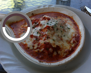
An example will be this lovely dish of lasagna.


The local color of the cheese is yellowish white 
But if I color-pick any part of the cheese, none of the areas are white or yellow.

and the tomato sauce is purple brown.

Why? Because the dish is in the shade.


Mixing paints:
In general

red + blue = purple 
red + yellow = orange
blue + yellow = green
Theoretically mixing red + blue+ yellow together gives you black but in the real world you will get a range from brown to a dark that looks like black (sorry, no #000000) depending on the pigments you use and the ratio you mix in.


A good way to practice mixing colors is to use limited palette.
My personal favorite is this
Earth Tone Palette:
Yellow ocher (your yellow)
Venetian red (your red)
Lamp black (your blue)
Titanium white

With this palette Lamp black + Titanium white will be your blue

Yellow ocher + Venetian red = warm orange
Yellow ocher + Lamp black = warm green
Venetian red + Lamp black + Titanium white = warm purple

Tips:
Though Ivory black is a stander black paint to have. I recommend not having black on a palette unless you are working limited palette. You can easily mix a richer black using ultramarine blue with burnt/raw umbra or any other dark paints.
If you do a lot of landscape it is good to have viridian green but again it depends on where you paint.
I use yellow ochre more when doing plein air because you can make a beautiful natural green.

Color is subjective. Those informations are from gather from personal experience and learning. If there are other methods (of course there are!) take the above as reference and exploring your own ways.


Color temperature:
The reason you need a warm and cool of the same color is because......
A warm light (ex: direct sunlight) creates a cool shadow and cool light (ex: overcast) creates warm shadow. So the same red chair will have different reds in the same scene. If both the light and dark are warm color the picture will look odd. When I first learned about this it completely changed the way I look at colors.
Same applies to colored light source. A red light creates a green shadow; a purple light creates a yellow shadow. 
A professor once brought in colored lightbulb and demonstrated the perception of colors in front of us.
Having that knowledge helps creating a richer image but for observational paintings you sill have to see it with your eye instead of assume it.

An example of warm and cool

On a color wheel
Blue are cooler than orange
Red are warmer than green


A really good way to learn about color temperature is to paint white object on white background. That is how I learned. Don't use photographs. They edited out too much information you will never be able to see those color differences. Having white on white removes the complication of local color and allows the eyes to look for value and temperature.

One of my favorite painter Wayne Thiebaud is really good at playing with color temperatures (I wish I can meet him before he die, sorry to say this but he is old.  Entering his 96 birthday day this year) 
Wayne Thiebaud, Cheese Slices (1986)
To find out which color is warm and which is cool. Gamblin has a good list.

Black and white color are usually listed as neutral but there are still warms and cools
Examples:
Titanium white (slightly blue) is cooler than Flake white (sorry, no #ffffff either)
Ivory black is cooler than Lamp black

Tips:
Do not add too much Titanium white in the mixed paint during early stage. It has a strong tinctorial power. It will affect the color of yellow most. If you want bright intense yellow, instead of adding white, try mixing cadmium yellow and lemon yellow (maybe just a little bit of white).
Mixing a cool yellow and warm yellow gives you neutral yellow. Same applies to blue and red and others.


Now comes Chemistry!
.
.
.
I won't actually go into the chemistry of pigments and oils because I don't understand them that well. Let's leave it to the experts.

Pigments:
There are inorganic (mineral) and organic (vegetable/animal) pigments.
From the colors in the stander full palette, most are inorganic pigments. Only Alizarin crimson (made from plants root) and ivory black (made from animal bone) are organic.

In the realm of inorganic pigments
Most heavy metal pigments are toxic. Yet a lot of colors are made from heavy metal.
Paint tubes contain cadmium, manganese, cobalt, nickel, chromium, mercury and lead are all consider hazardous. They are also very expensive. It can cause a fortune to buy a tube ($50 above for a 30ml tube. That's why you buy paints when they are on sales)

Flake white(or lead white) was a stander white before replaced by titanium white. It contains lead, cadmium and magnesium. Being a painter is hard life.

I really like Naples yellow deep, the real Naples yellow are made from lead antimoniate which are extremely toxic. The current one I use is a mixture cadmium orange, yellow ochre, titanium white, cadmium yellow light.


Earth pigments are non-toxic. they are found in rocks and soils.
Ochers
ex: yellow ocher, venetian red

Photo credit from Unearthed paints
Sienna
ex: burnt sienna, raw sienna

From Wikipedia
Umbra
ex: burnt umbra, raw umbra
Photo credit from Unearthed paints

Those pigments are usually cheaper.

Mineral pigments
ex: ultramarine blue
Ultramarine blue is my second most used color
The french ultramarine blue is more violet than ultramarine blue

Fun fact: Before 19th century, before synthetic ultramarine blue exist, ultramarine blue is more expensive than gold.

Organic pigments for another time. 

Tips:
The higher grade paint tubes are usually heavier.
Phthalo green is a very powering color. I remember my teacher warned us to have a separate palette for phthalos. Indeed, it can get everywhere. On your whites, your hands, your hairs, your shoes, and your friend's lunch.
Sienna and umbra are great for underpainting because they dry fast.


Paint's transparency:
Certain paint are more transparent than others.
The more transparent the paint the better they are for glazing.

Oil:
To be honest, I'm no expert on oil vehicle. I rarely use linseed oil (stand oil). I only use it when I need to work on multiple sessions to layer my paints. When doing plein air I use thinner only.

Linseed oil has many types: cold-press, hot-pressed, sun-refined, stand oil, raw, boiled, varnished etc. Cold-pressed being the best quality.
There are also poppy oil, walnut oil, soy bean oil and more. I tried walnut oil once. I like it a lot but again I don't use oil as much. (Please don't use olive oil, they will take forever to dry)
Some people add damar varnish to speed up the drying time but adding too much can crack the painting

Warning:
Linseed oil can catch fire on its own. I used to hear stories at school where student threw paper towel with linseed oil in the garbage can and the garbage can caught fire later that day.
When linseed oil oxidized it creates heat. With large amount of linseed oil around flammable object, it will start burning.


Solvents and thinner:
I use turpernoid (substitute for turpentine). Traditional paintings use turpentine. Some people uses mineral spirits. There are other thinners like alcohol, gasoline, Benzol, Methanol and more. Just looking at the names, it is not hard to conclude thinners are very flammable and bad for health.
All the solvents have different properties. How they act with the paint. How fast they evaporate. How strong the odor, etc. If you are really interested to learn more about the materials I recommend RalphMayer's "The Artist's Handbook of Material and Techniques" The book covers extended detail of everything I just mentioned.


Cleaning the bushes:
Important step if you want your brushes to last. I have ruined countless brushes because I didn't clean them the day and the oil dried making the brush unusable. The best you can do to save the brush is to soak it in soap with some water and try your best to get the residue off the hairs but your brush will never return to its former shape.

My way of cleaning brushes:
Clean the brush on a cloth 
Then use the thinner to wash off paints. 
Repeat until no paints left.
Use soap and water to clean off the thinner.

Reminder: 
Never pour solvents in to the sink. They must be dispose at special places. Hardware stores will collect them. I usually collect my turps in a glass jar. The pigments will sink to the bottom over time and the thinner can be reuse.

Sunday, April 10, 2016

Fantastic Beasts and Where to Find Them

I am very excited for this. 

The main character Newt Scamander is the author of the textbook "Fantastic Beasts and Where to Find Them." A required reading for Hogwarts first year students. The movie is probably about the adventure Scamander had that alternatively made him to write the book. I checked on IMDb, J.K Rowling is working on the second and third screenplay for the trilogy. It is going to be a trilogy...YES!


James Newton Howard's composition is thrilling

this is why I love film why I love environments because they bring your to another world. A world that exist only in imagination

Cabinet Logic

How you put things on the shelves depend on a lot of factors. By weight, size, color, importance et cetera.

In a studio I visited at Brewery District there is a cabinet with 3 shelves. The top shelf has mostly small glass bottles no bigger than few inches tall. The second shelf has bottles of paints. The bottom shelf are filled with hand tools use for crafting jewelry. On the floor are jars and cans of solvents. This mundane cabinet doesn't seem that interesting to strangers but if you were the owner. You must have at least thought about how to organized your things right?

The logic behind the placement: Solvents are dangerous os they go on the floor. It wouldn't cause much problem spilling them on the floor. Hand tools go on bottom shelf because they are the heaviest. Little bottles go on the top shelf because they are the lightest and easies to get lost. You will notice most of our precious small collections are placed around eye level if not higher than our eye level, unless they are stored in a bigger container. Then there left the middle shelf. paints go in the middle shelf.


Monday, April 4, 2016

Last week of March


Brewery Art Walk

Every year Brewery Art District open their studios for public to visit. 

I was too overwhelmed by the surrounding and ended up only doing one sketch. It's good to just walk around and take in the experience of bring present. I must be honest I was more interested in how artists decorated their studio space more than their artworks. 


 A lot of their kitchens looks interesting. 
Kitchen will tell you a lot about the habit of the person who lives there. 
(Sometime the restroom in a restaurant reveals a lot about the restaurant too)


I bet most people are not interested in looking at laundry room in the studio building, but look at those clothes just laying in the laundry machine without their owner. Who left it there?

The buildings themselves are very cool because they were mostly repurposed warehouse. You find traces of what they used to be.

I particular like this studio because it looks like a working space instead of a display. If it was just a display I said their've done a superb job at fooling me. 


Lot of plants and pots all around the Brewery 


One thing I learn about designing environments is not just make it look good but let it tell us story about the person who lives there.